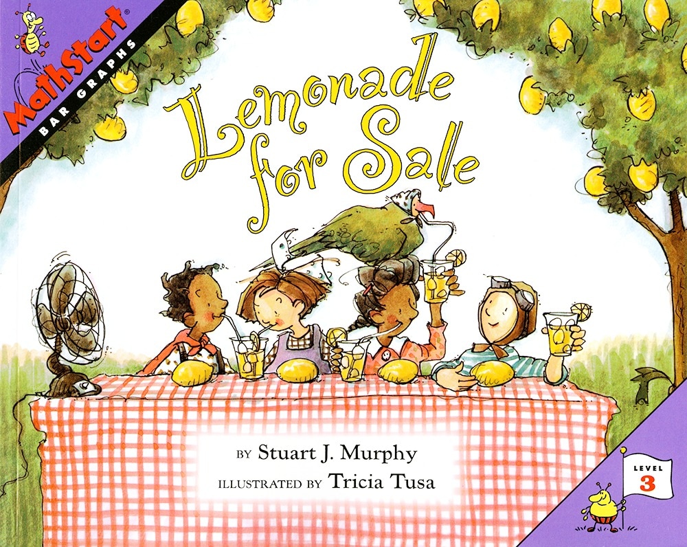
When members of the Elm Street Kids' Club decide to sell lemonade to raise money to fix up their clubhouse, they do it in style.
Dressed in special “lemon hats,” with Petey the Parrot, the club mascot squawking, “Lemonade for Sale!,” business booms at first. Sheri keeps track on a bar graph, plotting the number of cups sold against the days of the week. But sales drop quickly when Jed the Juggler comes to town.
What will the Elm Street kids do?
Gathering, charting and comparing data is an important skill for assessing progress and making predictions.
Illustrated by Tricia Tusa.
Read the story with your child or class and describe what is going on in each picture. Talk about the graphs that accompany the story. Ask questions such as: “On which day were more cups sold, Monday or Tuesday?” and “How many cups were sold on Wednesday?”
Talk about the different types of bar graphs that children may see. Those with bars that touch (A), or that show picture of the items being counted (B) are often included in school books. Those with space between the bars (C) often appear in magazines and newspapers. Collect examples of as many bar graphs as you can find and together discuss what information is being expressed.
Make graphs of things that happen in the real world such as children playing at the park, dogs being walked past your house, cars parked on the street,by counting them each day for a week. Do more children play at the park on the Monday or Saturday? How many cars are parked on the street on Tuesday morning? How many on Sunday morning? Does the number go up or down from day to day?
Set up your own lemonade stand with a group of friends and create a graph to keep track of the sales. On which day did you sell the most? The least? Show when sales were going up or down.